
Cover Art
bETTER FROM AFAR | lul sis
single COVER ART
JANUARY 2026
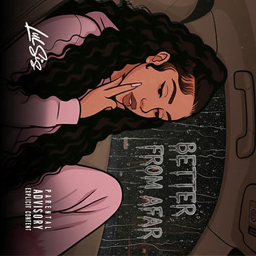

This cover art captures a quiet, late-night introspection wrapped in urban melancholy. A cartoon Sis curled into herself inside a car, rain streaking down the window beside her like unspoken thoughts sliding away. Outside the glass, the words “Better From Afar” drip and blur, mirroring emotional distance—what feels safer when observed from a distance rather than lived up close. Her soft pink clothing contrasts with the dark interior, symbolizing vulnerability against a guarded world. The pose—fingers resting against her face, eyes lowered—suggests reflection, restraint, and emotional self-protection. The muted color palette and gentle lighting create a calm, moody atmosphere, while the rain adds a sense of isolation, movement, and time passing. Overall, the artwork feels intimate and cinematic—like a paused moment between growth and heartbreak—capturing the tension between closeness and distance, longing and self-preservation.
b-rabbit | lul sis
single COVER ART
december 2026


The “B-Rabbit” cover and song are a direct homage to 8 Mile. The dark, minimal background reflects the gritty, underground world of the film, while the bold yellow title mirrors the iconic 8 Mile branding—symbolizing the spotlight, hunger, and visibility earned through struggle. The stripped-down design emphasizes raw truth over image, just like a rap battle where only the voice and words matter. The song embodies the movie’s core message: the underdog stepping forward despite fear, owning flaws before others can use them, and turning vulnerability into strength. “B-Rabbit” represents the moment before transformation—the hunger, pressure, and self-belief required to claim your space and be heard.
WE SHALL SEE | lIL DEV
ALBUM COVER ART
WINTER 2025


This cover art presents a bold and emotionally charged visual for We Shall See by Lil Dev. The central focus is a high-contrast portrait of the artist caught mid-expression—eyes clenched, teeth gritted—evoking a mix of pain, passion, and determination. His intensity radiates outward through surreal waves of black smoke and yellow flames, symbolizing internal struggle, transformation, and the heat of rising ambition. The background is muted and smoky, adding contrast and atmosphere without distracting from the artist. The use of fire and smoke effects gives the piece a raw, gritty energy that matches the emotional weight of the album’s title. The title is rendered in bold, futuristic metallic typography with a chrome finish, casting shadows that amplify its impact. This isn’t just an album cover. It’s a snapshot of growth, hunger, and refusal to fold.
CHANGED ON ME | SIZZLE
single COVER ART
november 2025


The cover for “Changed on Me” by Sizzle shows him sitting in the open door of a Maybach, giving a bold, unfiltered expression of confidence and defiance. The old-English gold lettering sits heavy across the image, reinforcing the theme of loyalty, betrayal, and standing tall through it. Everything about the visual says: I’ve been through it, but I’m still here—stronger, sharper, and unfazed. This cover represents the shifts we've all lived through—people switching up, loyalty breaking, and having to grow past the versions of yourself that depended on the wrong ones. It symbolizes resilience, independence, and how betrayal doesn't break us—it just pushes us to level up. The image speaks to the part of us that refuses to fold, the part that learned who’s real, who’s fake, and who never deserved access in the first place. It mirrors the journey: the pain of people changing up, and the strength of becoming someone who can’t be knocked off the path anymore.
WHOOPTY DO | LUL SIS
SINGLE COVER ART
SEPTEMBER 2025


This cover illustrates Lul Sis’s signature mix of humor, defiance, and realism through a minimal yet expressive emoji-inspired design. Beneath the figure sit a rat and a snake—symbols of deceit, fake loyalty, and hidden enemies—common motifs in street culture and rap narratives. Their placement below the artist suggests that while these betrayals exist, they’re beneath her level—something to be shrugged off rather than feared.
The clean white background, minimal palette, and subtle “Parental Advisory” mark keep the focus squarely on the message: staying unbothered in a world full of snakes and rats. The signature “Lul Sis” in the corner ties it together with a touch of authenticity and attitude—an unapologetic visual statement for a song that’s equal parts slick, savage, and self-assured.
WHO AM I TO COMPLAIN | LUL SIS
SINGLE COVER ART
AUGUST 2025


This cover art captures a haunting nighttime scene illuminated by the glow of red neon text reading ‘Who Am I To Complain?” The sign sits atop a dimly lit building, barely visible in the surrounding darkness, symbolizing a hidden truth or emotion quietly burning in the background. The overall color palette is stark and minimal—deep shadows contrast with the intense red glow, creating a moody, introspective atmosphere. This piece represents a moment of quiet reflection—the kind that happens late at night when everything is still, and your thoughts get loud. The question “Who am I to complain?” echoes feelings of humility, struggle, survival, and internal conflict. It speaks to the idea of having endured so much that complaining almost feels ungrateful—but deep down, there’s still pain that wants to be heard. The red lighting symbolizes both passion and warning—a visual metaphor for emotional weight, suppressed anger, or love turned bitter. It’s a statement about resilience, but also about the emotional cost of staying silent. The building being mostly hidden in the dark could represent parts of yourself or your past that you keep tucked away, only revealing enough to survive or tell your story.
idol eyes | lul sis
SINGLE COVER ART
JUNE 2025


This cover art features a striking and symbolic design. At its center are two intense, stylized eyes rendered in gold, with paint-like drips falling from them — creating the illusion of melting or crying gold. Above the eyes, the title “Idol Eyes” is written in a glowing, elegant script that adds a sense of allure and mystique. The background is dark, which makes the golden elements pop with even more contrast and impact. This design holds personal meaning because it visually captures complex emotions—like pain, power, beauty, and vulnerability. The luxurious gold suggests value and admiration, while the dripping effect hints at hidden sadness or a deeper truth beneath the surface. It’s both beautiful and haunting—like a mask that’s starting to melt. It represents the voice of the artist. It tells a story that’s more than just glamour—it's about being seen for who you really are beneath the “idol” image. This cover makes a bold visual statement that matches the emotional weight of the music.
4EVER | lIL DEV
SINGLE COVER ART
MAY 2025

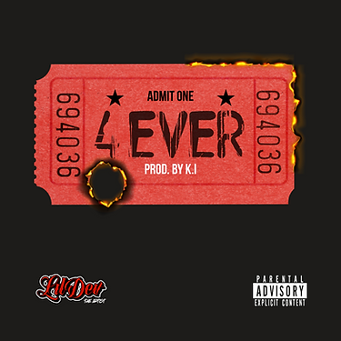
The artwork presents a concert-style admit-one ticket as the central visual element, colored in bold red to evoke urgency, passion, and intensity. This implies a personal or exclusive experience, as if this song is your entry into a significant emotional or life moment. It could also represent memories or moments that can’t be relived—once you use a ticket, it’s done. The ticket is partially burnt, especially at the top-right edge and with a prominent burn hole through the bottom-left side. These fiery details bring in strong themes of destruction, intensity, and permanence. This design feels deeply personal and likely reflects an emotion or memory you want to preserve “4EVER”—even if it’s been through fire. The burnt ticket could represent a moment that marked you permanently, one that can’t be undone or forgotten. Whether it’s about a lost love, loyalty to someone or something, or an inner fire that drives your music, this cover says: “This is my story. It burned me, shaped me, and I carry it forever.”
YOUR LUV | DON PABLO
SINGLE COVER ART
MAY 2025


This cover art is vibrant, bold, and provocative. It features a neon-style outline of a woman’s lower body, drawn with pink and blue glowing lines, giving it a nightclub or late-night city vibe. The image is sensual but stylized, avoiding realism in favor of an artistic, suggestive feel. The title "Your Luv" is written across the figure in elegant cursive, emphasizing intimacy and desire. Confidence and boldness is expressed and the ability to embrace sensuality and showcase emotion or desire through art. A blend of romance and allure - the neon aesthetic suggests a passionate, perhaps even playful or late-night love as the neon light style evokes the feel of city lights, clubs, or a vibrant nocturnal lifestyle.
I'M A DOG TOO | LUL SIS
SINGLE COVER ART
MARCH 2025
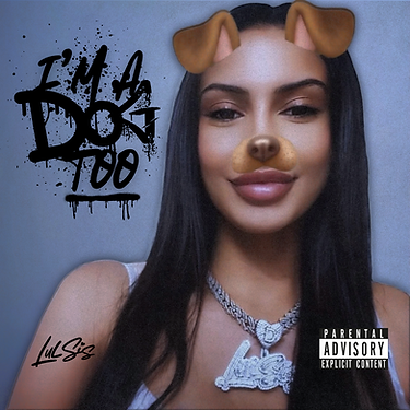

A combination of raw textures and a slightly grainy quality infuses the cover with an authentic, unpolished vibe, reflecting the true spirit of contemporary hip-hop. This design holds personal significance because it represents the intersection of traditional hip-hop culture and the digital age. The use of the dog filter adds a layer of modern digital culture, blending playful, contemporary elements with the assertiveness of the music. It serves as both a symbolic statement and a visual nod to the intersection of social media and identity in today’s world, reflecting how modern artists play with the boundaries of reality and persona. The gritty aesthetic captures the authenticity and rawness that I believe is essential to the genre, while the contemporary references reflect the evolving identity of hip-hop. To me, this cover art encapsulates how modern culture shapes and redefines the ways we express ourselves—blurring the lines between reality, image, and persona in a digital world.
MAN IN THE MIRROR | MAR
SINGLE COVER ART CANVAS
FEBRUARY 2025


This cover art for Man in the Mirror presents a cinematic, introspective design that centers on a rearview mirror reflection, capturing the essence of self-reflection and personal journey. The filmstrip overlay and grainy texture enhance the vintage, moody aesthetic, evoking a sense of nostalgia while adding depth to the composition. This design holds significant meaning because it symbolizes the constant process of self-examination and growth. The rearview mirror becomes a metaphor for looking back at one's past while moving forward in life, and the mirrored typography reinforces the idea that we are often our own reflections, shaped by experiences and choices. To me, this cover art represents a deeply personal journey—the tension between who we were, who we are, and who we are becoming. It’s more than just a visual—it’s an invitation to explore the complexities of the self, transformation, and the human condition.
CANDLES FREESTYLE | LI GREAZ
SINGLE COVER ART
FEBRUARY 2025

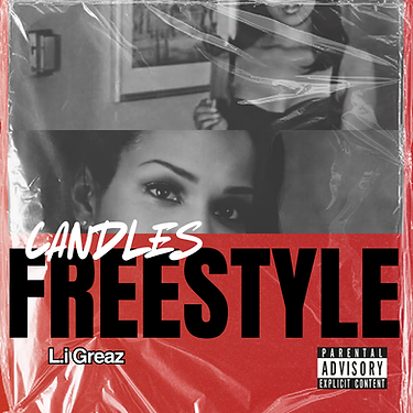
This rap cover art for Candles Freestyle by Li Greaz presents a bold, textured design that fuses collage-style imagery with powerful typography. The composition weaves together fragmented black-and-white photographs, evoking themes of nostalgia, raw emotion, and storytelling, allowing the viewer to interpret the layers of meaning behind the imagery. The juxtaposition of these elements brings a sense of depth and complexity to the design, perfectly complementing the essence of the track. This design carries personal significance because it represents a powerful blend of raw emotion and artistic storytelling. The choice of colors and textures reflects the intensity and complexity of the music, while the handwritten script echoes the personal, intimate nature of the lyrics. The fragmented imagery symbolizes the breaking down of barriers, both in the music and in the artist's journey. To me, this cover art is more than just a visual—it’s a snapshot of the energy, struggle, and authenticity that drives the track, capturing the essence of Li Greaz’s art in a way that feels both timeless and fresh.
PUFF OF BUD | MAR
SINGLE COVER ART CANVAS
FEBRUARY 2025


A hazy, laid-back vibe, perfect for a chill, introspective track. The image features a relaxed hand holding a lit joint, with wisps of smoke drifting into the air, adding to the atmospheric feel. The background is softly blurred, depicting a moody indoor setting with diffused natural light filtering through a window, enhancing the mellow aesthetic. A subtle grainy overlay adds a nostalgic, lo-fi quality, reinforcing the laid-back essence of the piece. This design holds personal significance because it embodies a sense of calm amidst chaos—a fleeting moment of stillness and reflection. The drifting smoke symbolizes release, while the softened lighting evokes warmth and solitude. The contrast between the vintage textures and the clean, contemporary typography mirrors the blend of old memories and new experiences. To me, this piece is more than just cover art—it’s a visual representation of escapism, capturing the beauty of slowing down and getting lost in your thoughts.
INHALE + BREATHE | WADE COLE

SINGLE COVER ART
FEBRUARY 2025

A moody and atmospheric visual that embodies the essence of relaxation, contemplation, and intensity. The textured overlay, reminiscent of crinkled plastic or fractured glass, infuses the piece with a gritty, urban edge, amplifying its raw and intimate allure. The dynamic typography features the title "Inhale & Breathe" in a free-flowing, hand-painted script, evoking movement and raw emotion. Conceptually, this project challenges conventional portrayals of femininity. The contrast—both visual and thematic—creates a compelling tension, blending softness with darkness. Deep shadows and muted tones establish a brooding, cinematic aesthetic, while the interplay between the ethereal wisps of smoke and the jagged, tactile textures adds depth and intrigue. The result is a striking and evocative cover that perfectly captures the moody, reflective energy of the music it represents.
IMPERFECT FLOWER | B CURRY
SINGLE COVER ART
FEBRUARY 2025


This cover art embodies a striking visual concept, where simplicity meets powerful symbolism. The intense, solid-red background radiates passion, love, and the raw edge of danger or heartbreak. Against this vivid backdrop, the track title appears in large, white, uppercase sans-serif text, creating a bold, eye-catching contrast. Piercing through the typography is a desaturated black rose—a symbol of mystery, rebellion, and imperfection. Its muted tones and thorny stem subtly convey themes of melancholy, struggle, and resilience. The rose’s stark presence adds a dynamic tension, visually representing the duality of beauty and pain, love and imperfection. This piece holds special meaning for me because it captures the emotional complexity that often lies beneath the surface of music. The contrast between the clean, structured type and the raw, organic form of the rose mirrors the emotional push-and-pull of human connection—flawed yet beautiful. It’s a design that not only complements the music but also tells its own visual story, making it a compelling and meaningful project to create.
RIDE FOR LOVE | MAR
SINGLE COVER ART CANVAS
JANUARY 2025

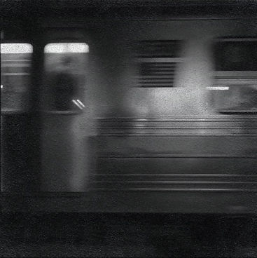
This project holds a special place in my heart—it was my first-ever Spotify animated canvas, created for an artist I deeply admire. The piece captures the emotional turbulence of chasing love through a dynamic, black-and-white subway scene. A blurred train speeds by, symbolizing the unstoppable force of passion and the fleeting moments we desperately cling to. The urban backdrop adds a layer of rawness and realism, while bold yellow typography slices through the grayscale, representing the vibrant intensity of love cutting through life’s chaos. The flowing script of "Ride" evokes elegance and vulnerability, while the commanding, modern font of "FOR LOVE" brings power and urgency—mirroring the contrast between softness and strength in the pursuit of connection. This piece grew from the idea that love is elusive and fleeting, yet once you grasp it, you’ll do anything to hold on. The project also marked a turning point for my skills, as it introduced me to the world of animated cover art—an exciting leap forward, especially seeing it live and in motion on streaming platforms. As the train rushes on, the canvas stirs feelings of longing, determination, and the relentless pursuit of love. Whether it’s a romantic ride or a soulful reflection, this visual perfectly complements the track’s energy, making listeners feel as if they’re moving—on a ride that never ends
TRILLION DOLLAR MIND | B CURRY
SINGLE COVER ART
JANUARY 2025
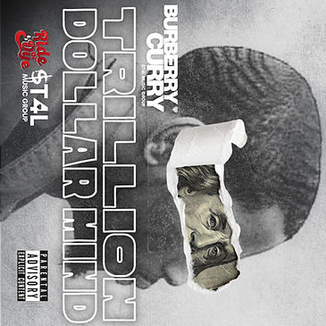

This cover art oozes sophistication and street smarts, layered with a raw, artistic edge. It was a particularly meaningful project for me, as I had the opportunity to transform a deeply personal moment—the artist's mugshot—into a powerful visual statement. The grayscale portrait, featuring a side profile, is fractured with a ripped paper effect, revealing Benjamin Franklin’s watchful eye from a $100 bill. This striking detail symbolizes the duality of struggle and ambition—wealth and resilience peeking through the artist’s psyche. The bold, blocky typography of "Trillion Dollar Mind" exudes power and audacity, while textured overlays and sharp contrasts add a sense of grit and authenticity. The rawness of the design mirrors the vulnerability of the artist’s journey, making this piece not just a visual but an emotional narrative. What made this project truly special was the collaboration—the shared trust and creative synergy. It taught me that when working with artists, every detail carries a deeper meaning. To visually capture their emotions and experiences is an honor. This piece is a testament to the connection between two creative minds—trillion dollar minds—bringing a shared vision to life with boldness and honesty.
MAJESTIC | burberry curry
SINGLE COVER ART
JANUARY 2025

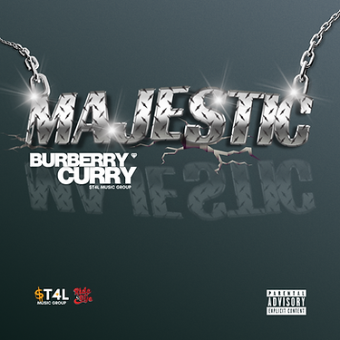
Bold confidence fuels this cover artwork, dripping with street opulence and unshakable attitude. The design commands attention through dominant typography techniques, with the title rendered in gleaming, diamond-plate metallic lettering. The high-polish sheen glints under the light as the text appears to shatter through a cracked surface—resembling a heavy chain necklace breaking free. This bold visual metaphor symbolizes power, resilience, and the defiance of limitations. The reflective, larger-than-life text takes center stage, exuding both luxury and raw force. The dark, moody background creates a stark contrast, making the illuminated elements feel even more imposing. The challenge of this project was capturing the realism of the reflection—achieving a natural, grounded look that made the lettering appear as if it had violently crashed down, splintering the floor on impact, mirroring Burberry’s hard-hitting bars. This project became a defining moment in my creative journey—pushing my authenticity and marking a shift in my artistic style. It stands as a testament to my growth, blending visual intensity with symbolic storytelling.
HOLD UP | 730RARRI + JAHKOY
COVER ART DAILY CHALLENGE
DECEMBER 2024


This project was part of a high-stakes contest hosted by Toronto’s Cover Art Daily, where the challenge wasn’t just the fierce competition—it was creating a design powerful enough to resonate with two established local rap artists. The cover art for "Hold Up" is a strikingly minimal yet provocative visual statement. At its core, an old, battered Nokia cellphone lies discarded in a desolate, overgrown field—its cracked screen faintly glowing with a haunting "No Service" indicator. The off-centered composition and atmospheric details, like trampled grass, flickering reflections, and faint static effects, lend the piece a cinematic, almost haunting quality. The imagery evokes a raw, nostalgic mood while symbolizing disconnection, resilience, and the irrelevance of outdated systems in a constantly shifting world. This project also marked my first venture into animating a cover—adding subtle motion that enhances the feeling of eerie isolation. The result masterfully balances nostalgia and rebellion, framing the forgotten relic as a metaphor for power struggles, missed signals, and the desire to break free from a hyperconnected yet fractured reality.
hd | burberry curry
single cover art
december 2024


What if you could view your life in high definition? Artistically, I experience everything in HD—and this track embodies that clarity. Emerging from the blazing streets of Chicago, it ignites with the energy of a life lived at full throttle. It’s an anthem for those who’ve walked through the flames—battle-scarred but unbroken—where every verse radiates with the hot intensity of struggle and triumph. Over smoldering beats that hit like pavement in a heatwave, Burberry Curry paints vivid, high-definition scenes of resilience and grit. His bars glow like molten metal, forging a sound that’s as raw as it is refined. This design is one I’m especially proud of—it marks a turning point where I began to see real growth in my artistic style. It’s more than cover art—it’s a visual declaration of survival in 4K. A testimony to burning through life’s infernos while refusing to lose your shine.
real is rare | lul sis
mixtape cover art
november 2024


A fearless diary blooming from the cracks of street life, Real Is Rare is a battle cry for the broken—a redemption story draped in hard-hitting beats and razor-sharp lyrics. Each track is a gut punch to the soul, pulsing with raw honesty and unapologetic energy. From fiery anthems that bite back at pain to tender moments of vulnerability that whisper hope, the mixtape is a testament to the resilience it takes to rise where others fall. Designing the cover art for this project was an incredibly meaningful experience, as it was the first mixtape I was ever asked to create. As a Lul Sis fan first, being trusted with such a deeply vulnerable project was both humbling and inspiring. This cover holds a special place in my heart—not only for its powerful message but because it marked the beginning of my journey in cover art design. Real Is Rare is more than music—it’s survival turned into sound, and having the opportunity to visually represent that made this one of the most influential projects of my career.
dope sellers (remix) | b. curry
single cover art
june 2024


Burberry Curry’s music takes listeners on a journey from pain to prosperity, blending haunting melodies with hard-hitting beats. His verses paint vivid scenes of cold nights, dirty money, and fleeting power—juxtaposed with the crushing weight of guilt, loss, and betrayal. Creating the cover art for Dope Sellers (Remix)—a reinterpretation of the original Millyz track—was an incredibly rewarding learning experience. The challenge was expanding the original photo to album-cover proportions while visually capturing the raw, unflinching essence of the track. The lyrics depict a soul trapped in a vicious cycle—striving for respect but drowning in regret. It’s not a glorification, but a reckoning—a poetic confession revealing the true cost of chasing survival in a merciless world. This project carries a powerful message, embodying the raw, unapologetic spirit of hip-hop culture. Being part of it was both inspiring and humbling—a creative experience that left a lasting impact.
men need love too | lul sis
single cover art
may 2024

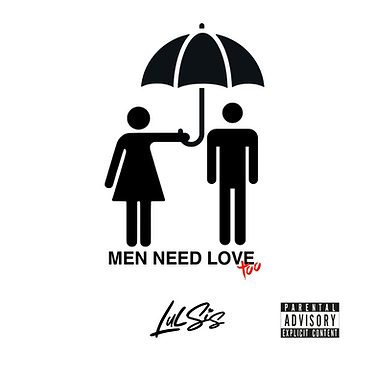
Creating the cover art for Lul Sis’ single, Men Need Love Too, was a profoundly meaningful experience, as it marked my introduction to the world of cover design. Collaborating with Lul Sis reignited my confidence in art and showed me the power of connecting with another artist on a deep, vulnerable level. The artwork captures the raw energy and unfair pressure that men silently carry. The minimalist design features washroom sign stick-figures, symbolizing the universal and faceless nature of this struggle. The high contrast and clean, sharp edges create bold, striking imagery, with the intentional use of red as the only accent color—signifying passion, pain, and urgency. The simplicity of the composition allows the message’s strength to come through the track’s lyrics, aiming to challenge stigma and shine a light on men’s mental health. The real challenge of this project was stripping the design down to its rawest form—pushing me to think outside the box and embrace the power of minimalism. This project will always hold a special place in my heart, as it reminded me that with passion and purpose, I can pursue anything.
dirty laundry | sweetbbykale
single cover art
april 2024


text here